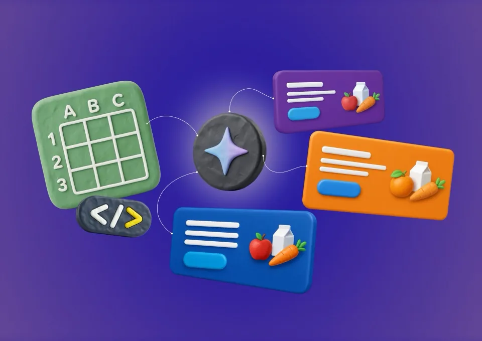
Milkbasket is a daily essentials platform built to make everyday grocery shopping effortless.
Problem: The online grocery category is crowded with similar offers, discounts and delivery promises. Milkbasket needed a distinctive brand identity that could communicate its unique service while remaining consistent across high-volume, fast-moving communication.
Key Insight: Convenience is not only about speed—it is about removing interruptions from everyday life. Milkbasket's silent early-morning delivery turns a routine transaction into an invisible, dependable habit.
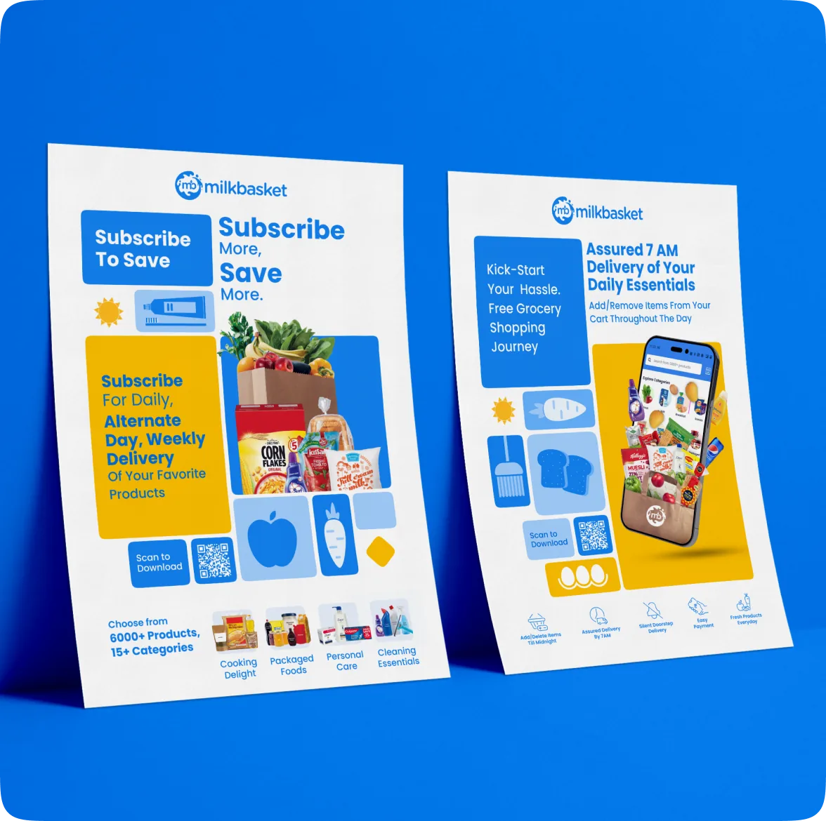
Approach: Built a modular visual and communication system around Milkbasket's core promise of silent delivery. The system adapts across app experiences, performance marketing, social media, CRM, campaigns, packaging and physical brand touchpoints while maintaining a recognisable voice.
Outcome: A scalable brand ecosystem that improves consistency, strengthens the silent-delivery proposition and enables faster creative production across channels—helping Milkbasket become part of the customer's everyday routine.
Milkbasket is a daily essentials platform designed to make everyday grocery shopping effortless. With a wide product range, competitive pricing and silent doorstep delivery by 7 AM, the brand fits seamlessly into customers’ routines. Its communication is simple, friendly and rooted in dependable everyday convenience.
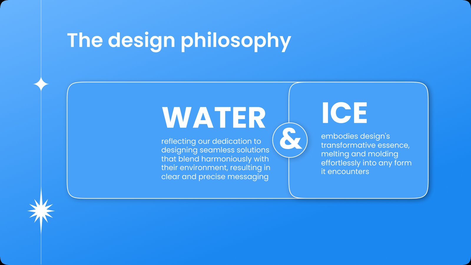

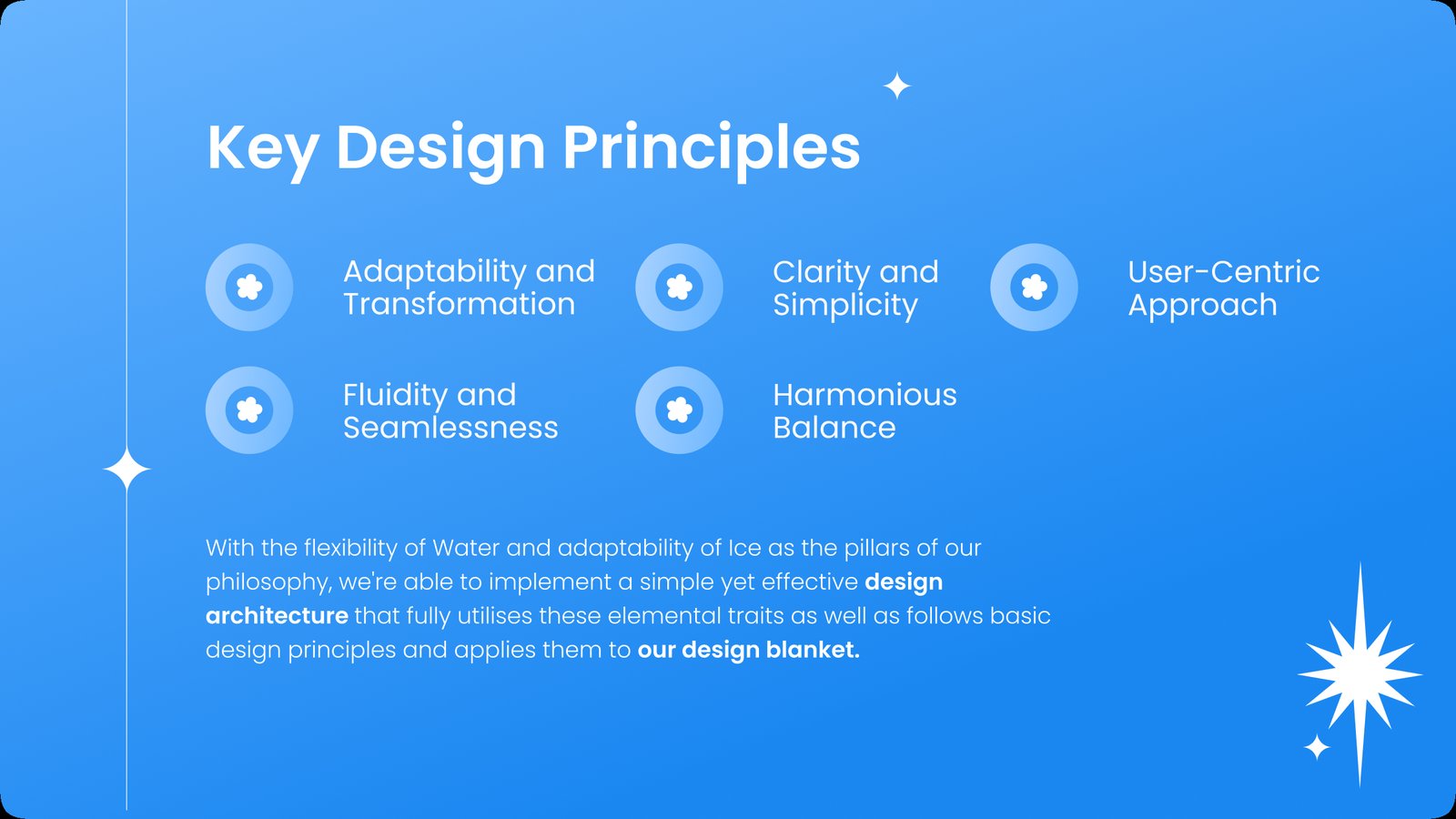
We introduced patterns as a flexible visual element within the Milkbasket design system to:
We adopted ‘Squircles’ as a modular building block within the Milkbasket design system to:
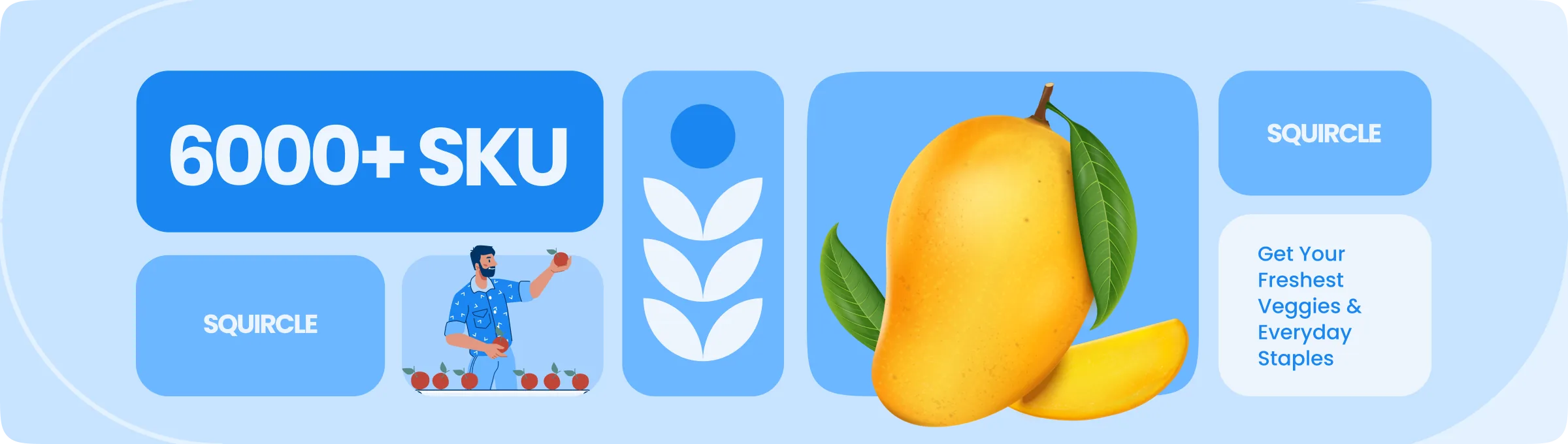
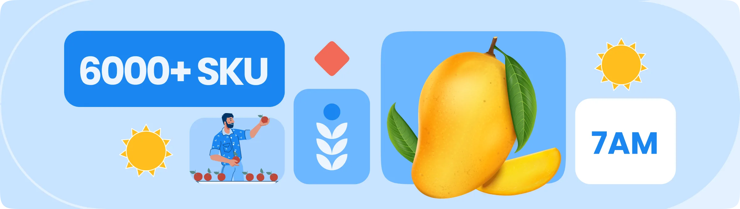
Replacing certain Squircle with Colourful illustrations and contrasting visual elements break large areas of uniform colour while making each pattern more descriptive and engaging. This creates stronger visual hierarchy, captures attention and builds a distinctive, memorable impression of the brand.
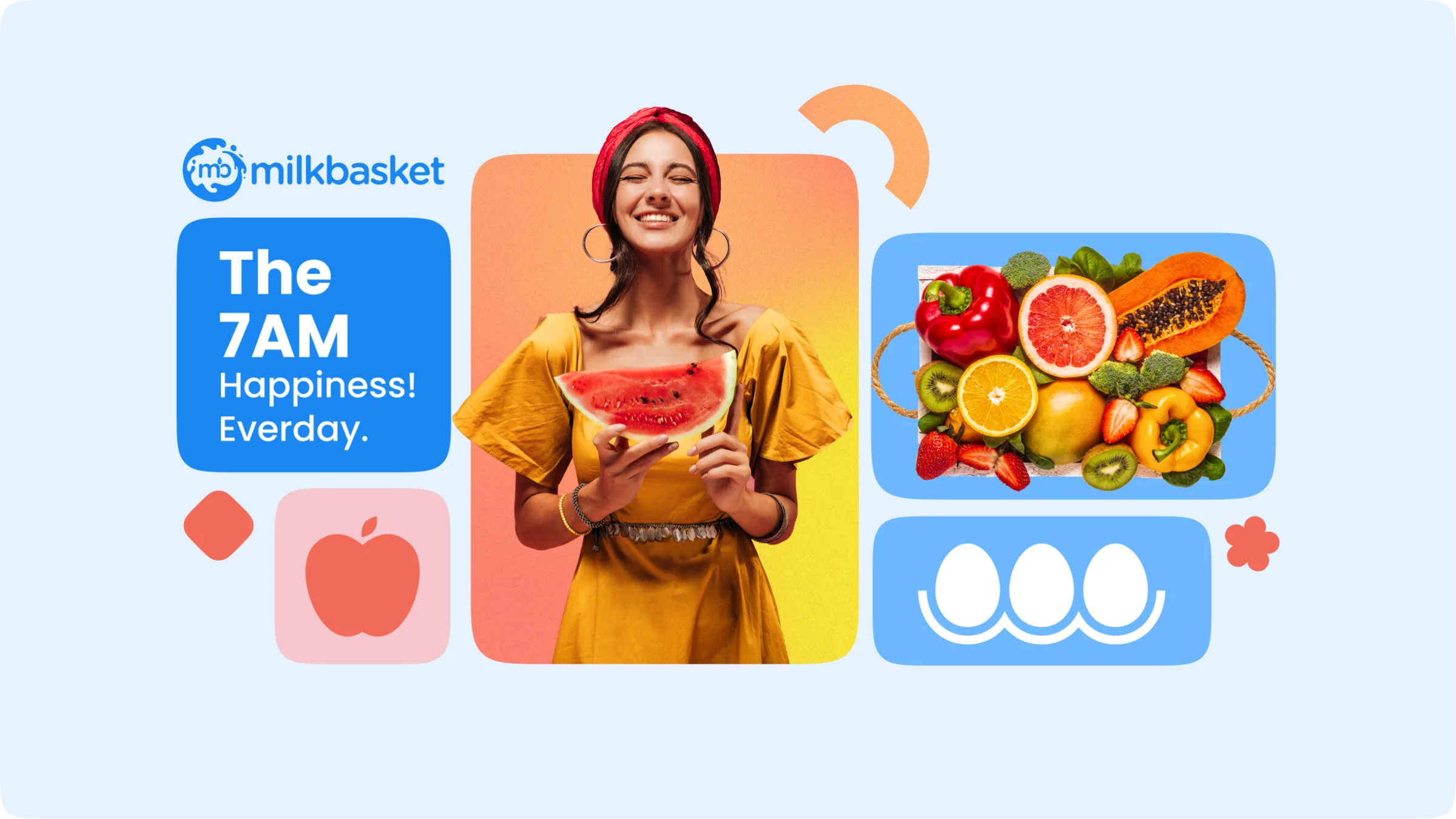
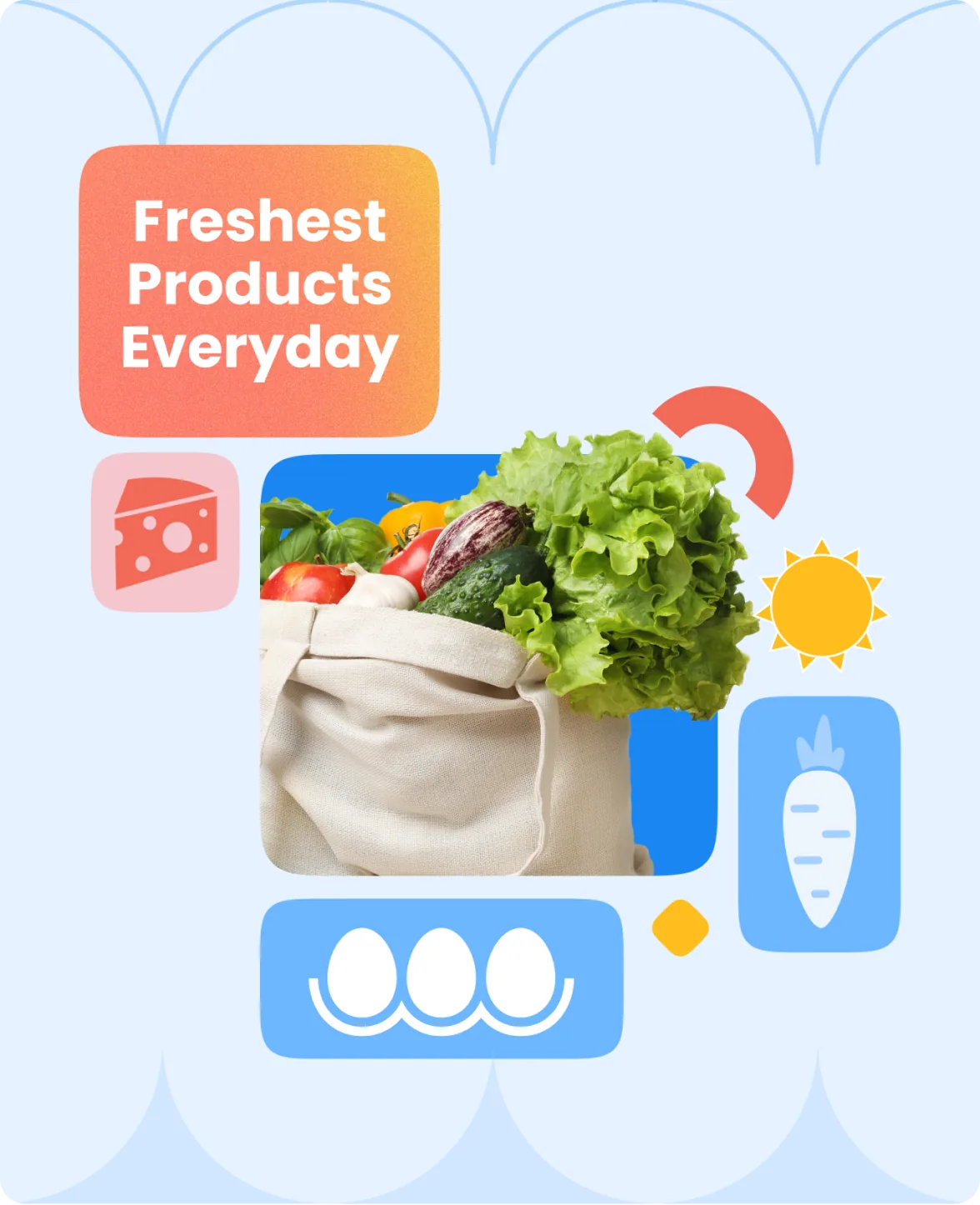
Motion here borrows its logic from water turning to ice: every interaction starts fluid and unhurried, then settles into place with quiet certainty - the same feeling you get when your delivery shows up right on time, every morning.
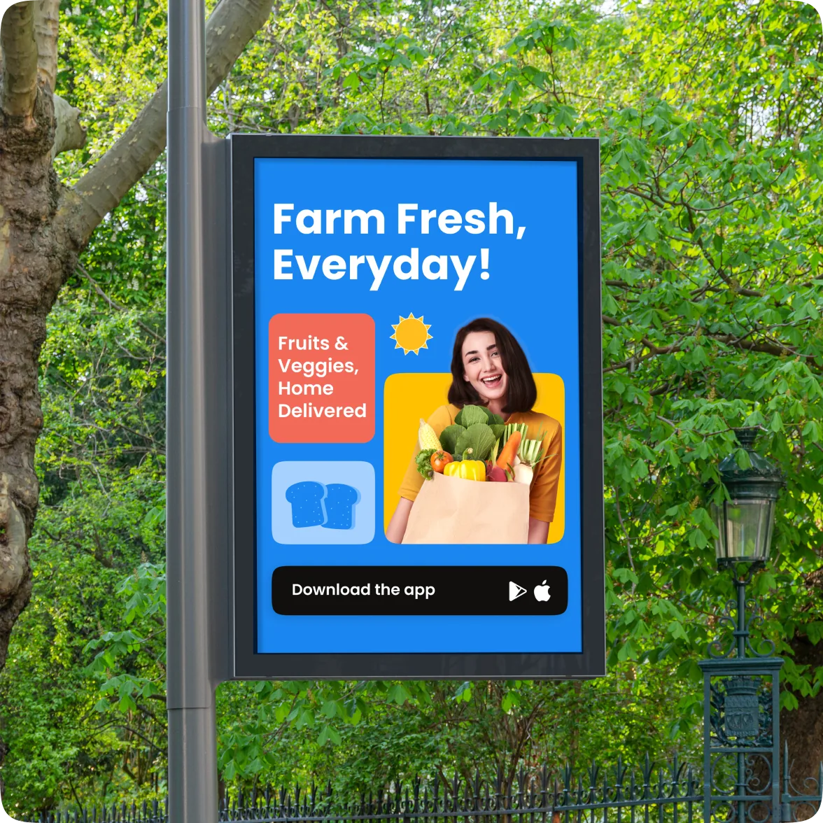
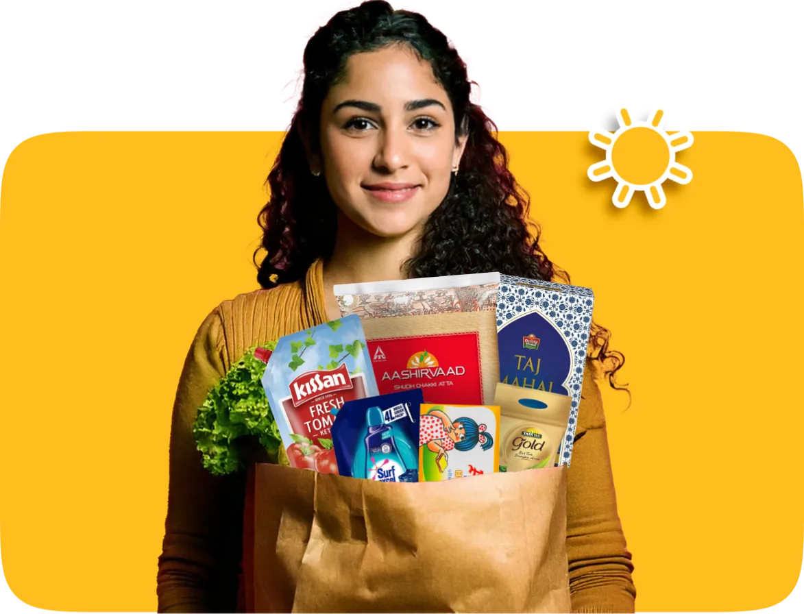
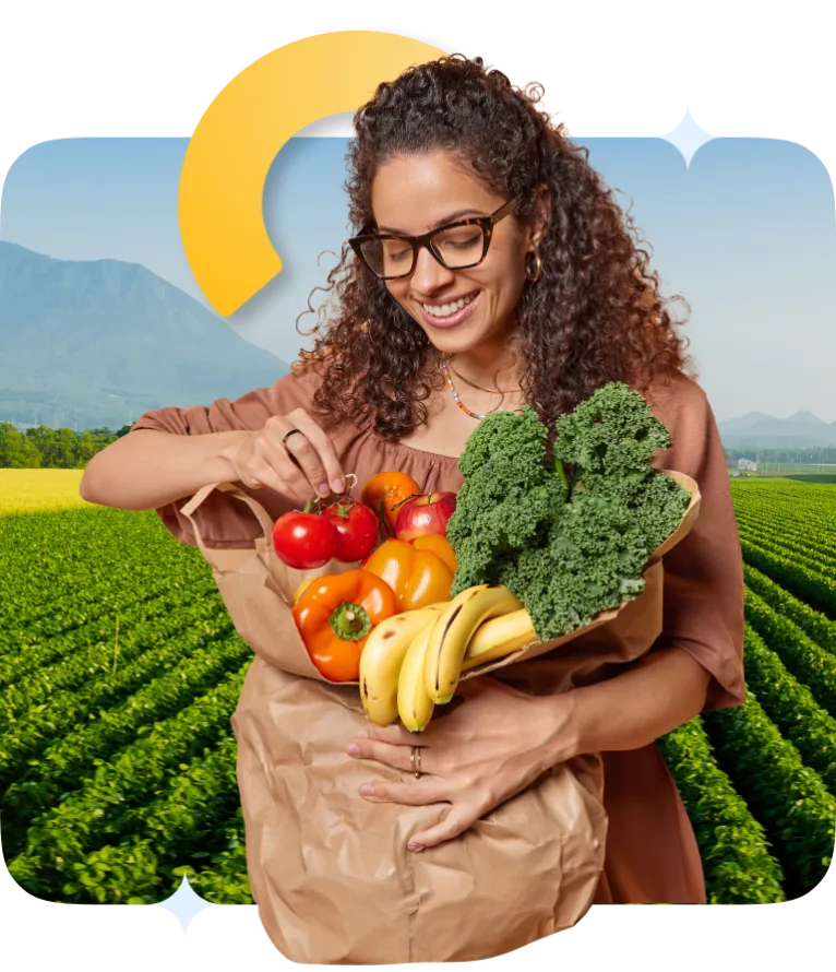
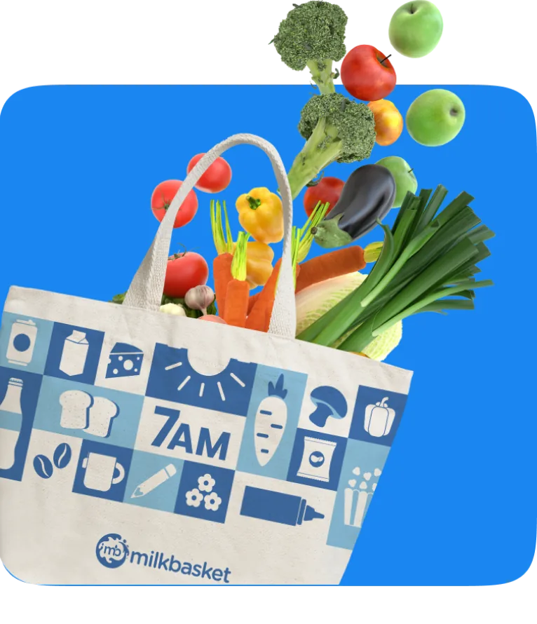
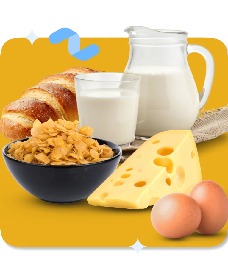
It's 7AM. Soft light, fresh morning, order already at the door.
Every Milkbasket photo lives in this moment - product front and centre on a clean, solid backdrop, bold primary colours as bright as the day ahead, and our signature squircle letting the subject bleed freely beyond the frame. Alive. Uncontained.
We shoot for happy. We shoot for uplifting. We shoot for the feeling of a great day, already started.
It's 7AM. Soft light, fresh morning, order already at the door.
Every Milkbasket photo lives in this moment - product front and centre on a clean, solid backdrop, bold primary colours as bright as the day ahead, and our signature squircle letting the subject bleed freely beyond the frame. Alive. Uncontained.
We shoot for happy. We shoot for uplifting. We shoot for the feeling of a great day, already started.


Experience The 7AM Magic
Experience The 7AM Magic
Experience The 7AM Magic
Experience The 7AM Magic
Experience The 7AM Magic
Experience The 7AM Magic
Experience The 7AM Magic
Experience The 7AM Magic
Experience The 7AM Magic
Experience The 7AM Magic
Milkbasket's second life — a Bollywood-inspired city takeover across Gurgaon, Noida & Bangalore, amplified with zero-budget FMCG brand collabs that broke the internet.
We tested, failed, and iterated rapidly. Scaling what worked, we built a highly efficient pipeline—moving users from top-funnel awareness, through consideration via social proof, to ultimate conversion with performance ads.
When you sell groceries across India, the app's hero banner is more than just another placeholder - it's a daily conversation shaped by regional culture, seasonal rhythms, and personal habits. We built a dynamic motion banner framework for the home screen, serving hyper-customized visual experiences that flex to the moment, ensuring every celebration and daily habit is met by context-aware design.
* Data compared versus pre-Reliance acquisition baseline — April 2026
The brand system we built didn’t end at delivery — it became the operational backbone for what came next: 10,000+ creatives a month, automated at scale, shipped without losing the brand’s voice.